Beauty, Entertainment, Food... TOP 40 rewards programs for customers in 2026
Read now

The loyalty engine determines what your program can do. The front-end determines whether members notice, care, and come back.
That distinction matters more than most loyalty teams acknowledge. A well-configured rules engine with challenges, streaks, real-time point processing, and tier logic does little for a member who cannot easily see their progress, does not receive a nudge at the right moment, and has to navigate three screens to find their reward balance. The engine is invisible to members. The front-end is the entire product they experience.
This creates a specific problem for anyone who owns a loyalty program: the front-end is usually someone else's job. The development team builds it. The design team styles it. The product team decides what goes on the home screen. And loyalty, if it is not advocated for clearly and early, ends up as a tab buried in settings.
This article is for loyalty managers, product managers, and CRM professionals who want to specify what good front-end design looks like, brief their design and development counterparts on why it matters, and evaluate what they have against what works. It draws on independent research, behavioral economics, and real program examples. It also focuses on loyalty platforms that decouple frontend and backend.
One number worth keeping in mind: the average consumer participates in 17 loyalty programs, according to research from McKinsey cited in Paytronix's Annual Loyalty Report. Your members are experienced. They have used good and bad loyalty front-ends. They notice the difference faster than you think.
Before discussing specific UI patterns, there is a design decision that sits above them all. Does loyalty live within the core product experience, or in a separate hub?
The answer shapes everything else: a loyalty experience embedded in the main product app, surfaced at the moments that matter, operates on completely different design principles from a standalone loyalty portal or a dedicated rewards app. The embedded experience serves the member's task at hand. The separate experience asks the member to redirect their attention entirely.
The programs most often cited as front-end exemplars are not the ones with the most complex mechanics. They are the ones where loyalty information appears where members already are.
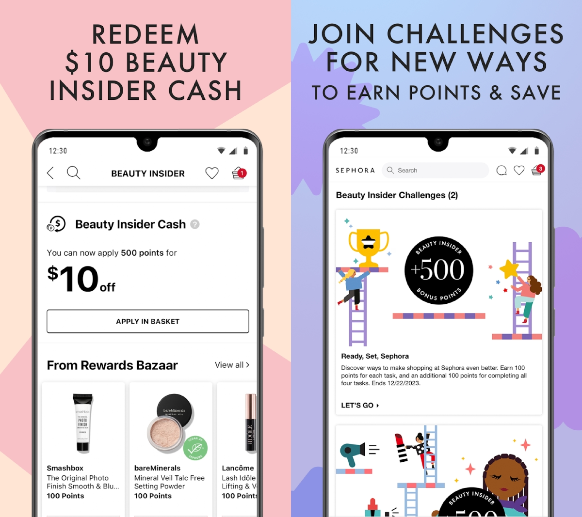
Sephora's Beauty Insider surfaces tier status, available rewards, and progress toward the next tier directly in the shopping experience. A member browsing products does not need to navigate to a loyalty section. The information is already present.
Nike Membership surfaces progress and membership benefits within the Nike Training Club and Nike Run Club, and workout flows directly.
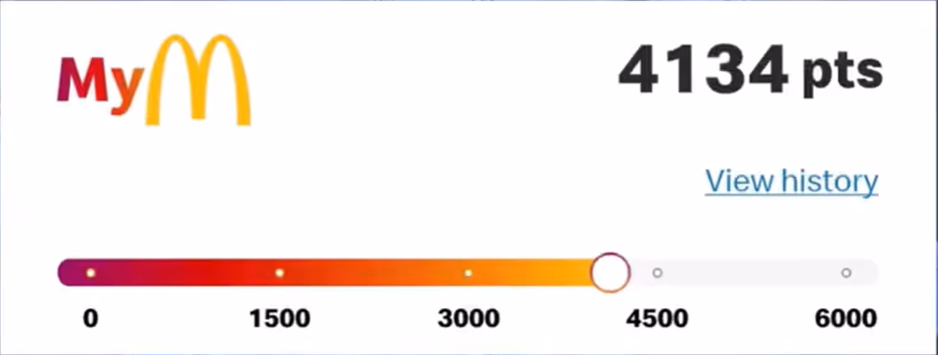
McDonald's MyMcDonald's Rewards displays points earned on the post-order confirmation screen, the moment when a member has just completed a transaction and is most receptive to reinforcement.
This is the principle behind the integration argument: design for where the member's attention already is, not where you wish it were. A member who just placed an order is already in the app, already engaged, already thinking about their purchase. That is the moment to show them what they earned and what they are working toward next.
”Conversion lives where attention already is. The home screen, the checkout, the order confirmation – not a tab two taps away," explains Marcel Stuliglowa, Lead Designer specializing in loyalty and high-engagement solutions.
Usually, the decision to create separate apps or spaces is not based on the users’ needs at all, which is dangerous.
“Members don't ask for a separate loyalty section – it exists because someone internally owns that space."
"That’s because hub-based loyalty is usually an org-chart artifact, not a user need. It's Conway's Law applied to product: the org chart ships as UI.”
The result is a program that serves the org chart but frustrates users.
"And clicking away from a core flow has a real cost. The obvious one is churn risk. The harder one is attention – once you've spent the customer’s attention, you don't get it back in the same session.”
A dedicated loyalty app asks members to maintain a second digital relationship with your brand. Most do not sustain it. Lumitech's 2025 UX case study on loyalty platform design put it well: "Users don't think in channels. They think in tasks." A member might see a promotion on social media, check their balance on the app, and redeem in-store. If the visual language, terminology, and rules change between those touchpoints, trust erodes. The program starts to feel like a different product from the brand they know.
The data from Markswebb's 2025 study of Starbucks and Sephora confirms the UX implication: making the rewards section easy to reach from multiple places in the app, rather than routing members through a single loyalty entry point, measurably reduces cognitive load and increases redemption rates.
Airline frequent flyer programs and coalition loyalty portals break this rule, and they work. British Airways Executive Club, Aeroplan, and Qantas Frequent Flyer all support dedicated management apps or portals alongside the airline's main booking experience. The reason is specific: the transactions are high enough in value that members are already motivated to seek out their status. Someone with 80,000 points who is deciding whether to use them for an upgrade will navigate to a portal. They have already decided to engage. The program does not need to surface itself proactively.
For most loyalty programs, regardless of industry, that level of pre-existing motivation does not exist. Integration is the default, and separation is the exception requiring specific justification.
"Surface loyalty at the right moment" is advice that requires industry-specific translation.
Frontend-agnostic gamification engines such as Open Loyalty can power an eCommerce, a bank, a football club, and a fashion retailer: the moment that works in each is completely different.
The examples below are drawn from industries where the trigger timing is particularly distinct. The underlying principle holds across hospitality, travel, telco, healthcare, automotive, and any other category where members interact with a brand on a recurring basis.
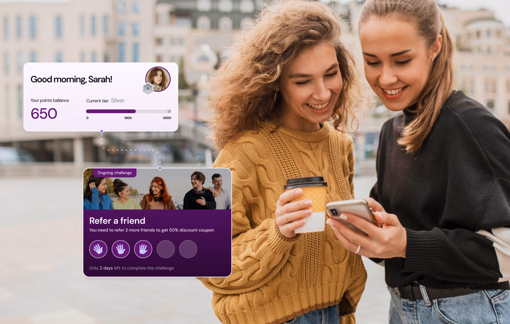
The most powerful loyalty trigger in retail is the near-tier-upgrade nudge: telling a member they are close to the next tier at the exact moment they are deciding whether to buy. Tiered loyalty program design covers the mechanics behind making this work at scale.
This is grounded in the Goal Gradient Effect, a behavioral phenomenon first documented in 1934 (Hull) and confirmed specifically for loyalty programs by Kivetz, Urminsky, and Zheng in a 2006 Journal of Marketing Research study. Their finding: members accelerate their purchase frequency measurably as they approach reward thresholds. The closer a member gets to a reward, the more motivated they become to reach it.
The practical front-end implication: a member who can see they are close to the next tier before completing a purchase has a concrete reason to add one more item. The mechanic works precisely because it meets the member at the moment of decision. Sephora's Beauty Insider applies this by keeping points totals and tier progress visible throughout the shopping experience rather than routing members to a separate loyalty section to check their status.
Post-purchase is the second high-value moment.
The confirmation screen, receipt email, and in-store receipt are all surfaces that most brands underuse for loyalty. Starbucks takes this further: the Markswebb 2025 study documents that Starbucks surfaces loyalty program details and a clear option to join directly in the cart for users who have not yet registered, ensuring the program value is visible at the exact moment a purchase decision is being made.
QSR loyalty operates on frequency, not basket size. The design objective is to reinforce the habit loop: visit, earn, come back sooner because the next reward is close.
The front-end mechanics that serve this are streak indicators (you have visited 4 Tuesdays in a row), time-sensitive offers tied to visit frequency (a bonus offer that expires if a member does not visit within the week), and the post-order confirmation screen.
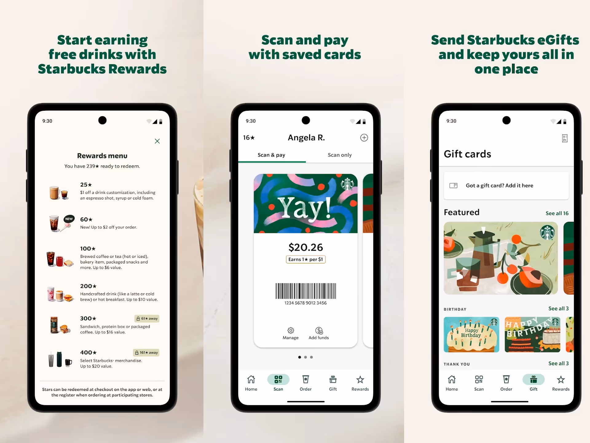
Markswebb's 2025 study identifies the Starbucks Rewards home screen progress bar as a front-end best practice: "A progress bar on the home screen drives activity among loyalty program members."
What makes it effective is placement, not design complexity. The bar is on the first screen a member sees when they open the app, not hidden in a loyalty tab. The goal is immediately legible. No navigation required. (Note: Starbucks introduced a new three-tier structure in March 2026, after Markswebb’s study was done).
McDonald's MyMcDonald's Rewards pairs this with gamified challenges, short-duration missions that give members a specific behavioral target beyond the baseline earn rate.
The front-end design here has to do two things simultaneously: communicate the ongoing progress toward the base reward, and surface the challenge clearly enough that the member understands what they need to do without having to read instructions.
The results quantify the habit loop: McDonald's Q4 2025 earnings call confirmed the habit loop in numbers: the average U.S. customer visited 10.5 times per year before joining the loyalty program and 26 times in the twelve months after joining, according to the CFO Ian Borden (full transcript via Motley Fool). Loyalty-linked systemwide sales reached nearly $37 billion for full-year 2025, per the official press release.
"QSR screens fall into what designers call the Christmas tree – every team adds a streak, a challenge, a badge, and nothing reads as important anymore," says Marcel.
"You should pick one primary mechanic per screen state and let the rest surface only when they're contextually active."
Another aspect teams underestimate is streak forgiveness, which Duolingo does well with Streak Freeze.
“A member who misses a Tuesday after a four-week streak doesn't restart – they churn. One skip a month costs the program almost nothing and saves the members who would otherwise walk."
Fintech loyalty front-ends have a specific problem that retail and QSR do not: the reward currency is often financial, which means members are constantly calculating its value and will disengage if the math feels unclear or unfair. The bank loyalty programs guide covers how leading financial institutions have approached this design challenge across different market contexts.
The design response is transparency and translation. Rather than displaying a proprietary points balance that requires mental arithmetic to value, the front-end should show what the reward is actually worth in the terms the member already uses: currency, percentage, or plain-language equivalents ("spend $100, get $5 back"). This matches Nielsen's heuristic of using words and concepts familiar to the user, not system-oriented terminology.
Members in financial apps are comfortable with numbers, but the cognitive work should be done by the interface, not by the member.
Nubank, one of the largest neobanks in Latin America with over 100 million customers, demonstrates this at the premium tier: Nubank Ultravioleta earns 1.25% cashback on all credit card purchases, shown as a real currency amount that is instantly available without waiting for the invoice to close. The reward is legible even before the purchase is made.
Markswebb identified a related best practice in its Sephora analysis that translates directly to fintech: showing redeemed rewards as product cards (with date, brand, and a product image) rather than a deduction entry in a points ledger.
The principle is the same in both categories: make the value tangible and concrete, not abstract. A member who sees "you received $12 cashback last month" engages differently than a member who sees "1,200 points redeemed."
The cross-product usage trigger is also specific to financial platforms: a member who uses payments, savings, and insurance receives more from the program than one who uses only payments.
The front-end needs to surface the additional value from the other services without being so aggressive that it reads as an attempt to upsell. The design solution is usually a milestone indicator: "use one more product to unlock your next tier," surfaced in the member's main dashboard rather than buried in a loyalty section.
"Treat the reward UI like a bank statement, not a slot machine," Marcel Stuliglowa adds.
"Countdowns, red timers, deal-of-the-week framing – these break trust immediately in a financial context, even when the offer is genuine. The frame is 'earn extra interest rates,' not 'deal of the week.'
Similarly, animations should stay subtle and brief.
“The moment a financial app looks like it's running a sale, members start wondering what they're actually being sold."
Sports loyalty operates on a different emotional register than other verticals. The transactions (attending matches, buying merchandise, watching streams) carry inherent meaning for the member beyond the reward value attached to them. A front-end that treats a match attendance the same way a QSR app treats a burger order misses the engagement opportunity entirely.
"Sports loyalty is about status, full stop," says Marcel Stuliglowa.
Which means it’s all about comparing.
"'You earned 500 points' is flat. But 'You're a Level 5 fan' works. And 'Better than 90% of fans' is the version that actually moves people."
The most effective sports loyalty front-ends tie achievement unlocks to moments that already matter to fans: attending consecutive matches, watching a cup final, completing a challenge during a derby weekend. The points or rewards attached to these actions are less important than the achievement framing. The front-end needs to communicate recognition, not just balance.
The academic backing is Tajfel and Turner's social identity theory: group membership is identity-forming, and badges are public signals of in-group standing.
The UX implication is that sports loyalty UIs benefit from being visible to others, not just to the member – profile cards, leaderboards, percentile signals. These tap a dimension fintech and retail can't.
"Tribal naming matters too," Marcel adds. "Silver, Gold, Platinum is generic. Club-specific tier names – regional references, historic ones, founder names – feel earned in a way that metallic ladders don't."
Attendance streaks are a proven mechanic here.
Club Brugge's fan loyalty program delivered a measurable result: matchday attendance rose 8% and spend per fan rose 13.3% with the program in place. The club describes its app as a "personal wallet" for loyalty points, digital tickets, and rewards, integrating loyalty directly into the fan's primary digital touchpoint rather than running it separately.
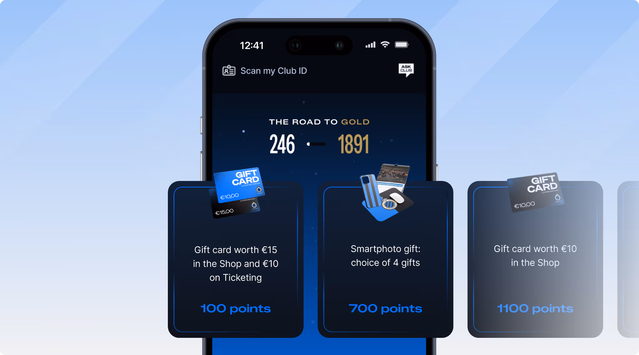
The program has evolved for the 2025-2026 season from a cashback model to a points-based system (Road to Gold), where fans earn points for purchases, match attendance, fan activations, and early stadium arrival. The front-end design principle is the same: make the streak and progress visible before the next match, not buried in a loyalty section.
A member who has attended four home matches in a row has an investment in maintaining that streak, partly because of the reward and partly because of the identity signal it carries. Surfacing that streak prominently in the app, via a push notification the morning of the fifth match, is both a behavioral trigger and a recognition moment.
Push notification timing is particularly consequential in sports. A notification sent the morning of a match, when the fan is already thinking about the game, has a fundamentally different open rate than one sent mid-week with no game context. The front-end for sports loyalty needs to be designed around the sports calendar, not a generic re-engagement cadence. This requires the loyalty engine to support behavioral triggers tied to external event data, not just transaction events.
For more on how clubs design these mechanics, the top football loyalty programs explores how football clubs manage to go beyond transaction loyalty.
Social proof elements also perform differently in sports than in other categories. Showing a member how many other fans have completed a streak or earned a specific badge taps into the community dimension of fan identity in a way that a cashback display cannot. The front-end decision here is where to surface that social signal: the achievement unlock screen, the member dashboard, or a dedicated community feed.
Some industries face a special challenge in owning the transaction moment.
In ecommerce, the problem is structural: Baymard Institute's 2025 aggregate of 50 studies puts the average cart abandonment rate at 70.19%.
Seven in ten customers who add a product to their cart do not complete the purchase. The post-purchase confirmation screen remains the highest-attention loyalty moment available, but only for the 30% who convert.
The front-end challenge is recovering engagement from the majority who do not: a points nudge before checkout ("you are 50 points away from your next reward") addresses the decision moment that most loyalty programs ignore entirely.
CPG loyalty programs face a more fundamental version of the same problem.
CPG brands sell through retailers who own the transaction. As a senior marketing executive at Colgate-Palmolive put it in AdExchanger: "We've always had to trade on data we don't own or control." The front-end cannot intercept a purchase it never sees.
Pack-scan mechanics and UGC submission triggers move the loyalty interaction outside the store and into the moments the brand does own, but only if those mechanics are discoverable without requiring the member to seek them out.
A loyalty app that has to be actively opened to participate will be ignored.
D2C subscription loyalty has the opposite problem: the transaction is too automatic. A subscription renews automatically, which means the member is never at a moment of deliberate purchase decision.
The loyalty signal needs to appear in the space between orders rather than at the transaction itself. A member approaching renewal who can see they are close to a tier upgrade has a concrete reason to stay rather than cancel. Without that visibility, the renewal happens silently, and so does the churn.
The mechanic differs in every category, but the diagnostic question is always the same: when is the member's attention already on your brand, and is the loyalty signal there to meet it? The answer differs for a healthcare app, a travel program, a telco, or an automotive service. The question does not.
Several design principles hold across all the categories above.
The most common front-end failure in loyalty is routing members to a dedicated loyalty section to find information they should already be able to see. Nielsen's first usability heuristic is visibility of system status: the system should always keep users informed about what is going on.
In loyalty, this means balance, tier, and progress toward the next reward should be visible in the member's main dashboard or home screen, not two taps away.
Markswebb confirms this in its Starbucks analysis: "A banner with program status information increases engagement." The banner is not in a loyalty tab. It is on the screen the member already has open.
A raw points balance communicates almost nothing about proximity to the next reward. A progress bar toward the next reward is substantially more effective. As stated in the Goal Gradient Effect: motivation to reach a goal increases as perceived proximity to that goal increases. A member who can see they are 80% of the way to a reward behaves differently from a member who sees "800 points" without any reference to what that means.
The practical design requirement: the front-end needs to know both the member's current balance and the threshold for the next meaningful reward. This requires the loyalty engine to surface both values via API, not just the balance.
The moment immediately after a transaction is the highest-attention window in the member journey. Markswebb: "Showing program details and status immediately after registration helps users take the first step." Lumitech: "Show benefits immediately after key actions." Both observations point to the same design principle: the post-purchase, post-redemption, and post-check-in screens are where the loyalty experience is most likely to be noticed and acted on.
Designing for these moments means the development team needs to integrate loyalty display into the transaction confirmation flow, not add it as a separate step afterward.
In practice this is an organizational challenge as much as a technical one. Confirmation screens are often owned by a different team from the one responsible for loyalty. The checkout team owns the post-purchase screen. The in-store team owns the receipt. Getting loyalty surfaced consistently across all of them requires organizational alignment as much as technical integration. This is why specifying the post-action moments as part of the loyalty brief, not the development brief, matters.
Abstract currency is a recurring trust problem in loyalty front-ends. A member who does not understand what 750 points is worth will discount the program entirely. The design response has two components: translate the currency into plain-language value at every display point, and show the value already delivered.
Markswebb's best practice here is particularly useful: displaying redeemed rewards as visual product cards rather than ledger entries.
The analysis found that this transforms abstract points into tangible proof: members can see exactly which products they received for free and when. Framing loyalty value as something already delivered, rather than a future promise, is a meaningful engagement lever.
Nielsen's ninth heuristic is recognition over recall: users should not have to remember what to do next; the interface should tell them. In loyalty, this means the front-end should always surface one clear next action: the challenge to complete, the threshold to reach, the reward available to redeem. Lumitech: "Clear flows, simple steps, and an obvious next best action transform rewards into small repeat habits."
The design constraint: this requires the loyalty engine to surface contextual, member-specific next actions via API. A generic "explore rewards" call to action does not meet this standard.
NN/G's 2024 research on self-determination theory applied to gamified UX found that allowing members to choose how they use an interface increases their perceived ownership of the experience and the value they place on it. In practice, this means offering redemption options (spend points on a discount, a product or a donation), letting members configure notification preferences and allowing them to browse the reward catalog in ways that reflect their interests.
It is also the heuristic most often omitted from loyalty front-end specifications, and the one most likely to distinguish a program that feels personal from one that feels mechanical.
The Endowed Progress Effect, documented by Nunes and Drèze (2006) in the Journal of Consumer Research, adds a related design lever: members given a head start on a goal complete it faster than those starting from zero. The implication for loyalty onboarding is specific: a welcome bonus that gives new members a partial balance immediately (rather than starting at zero) measurably increases early program engagement. Markswebb confirms this: "Welcome gifts and congratulatory messages enhance perceived program value and encourage first actions." The front-end needs to surface this starting balance prominently during onboarding, not bury it in a welcome email.
Lumitech: "Users don't think in channels. They think in tasks."
Loyalty that looks like a different product from the main app, or that uses different terminology in the email versus the in-store receipt versus the app notification, trains members to treat the program as an afterthought.
Consistency in visual language, naming conventions, and rules across every surface is a design requirement, not an aesthetic preference.
This is where headless loyalty architecture matters: when the loyalty engine exposes data and logic via API, and the brand's own front-end team controls every surface, consistency is achievable by design. The brand owns the member experience end to end, and the loyalty display is not constrained by a vendor template.
Loss framing converts. Marcel Stuliglowa points to Kahneman and Tversky's work on loss aversion: losses register roughly twice as hard as equivalent gains – which is why "don't miss out on the voucher" generates a stronger response than "log in and win the voucher."
The temptation to lean on that asymmetry is real, but it compounds trust debt over time.
"Loss framing converts faster, but the debt shows up later," Marcel adds.
"Members convert once, then start reading every nudge as pressure. The clicks come in early and dry up later. Fake countdowns, manufactured urgency, dark-pattern timers – these create anxiety, not engagement. And anxiety doesn't retain."
The sustainable alternative is gain framing: surface what the member earns, not what they stand to lose. It converts more slowly and does not erode the relationship.
The checklist below is not about building the mechanics of the loyalty program. It is about the front-end layer that sits on top of them: the decisions that determine whether members actually notice and use what has been built.
For a benchmark analysis of how leading programs implement these decisions in practice, the mobile loyalty app report covers UI and UX patterns across 10 major programs.
Each row in this table translates to a specific API requirement from the loyalty engine: balance and threshold data for the progress bar, transaction-level event data for the post-action screen, next-action logic for the contextual prompt, and redeemed reward data for the history display. The front-end cannot surface what the engine does not provide. Both sides of the integration need to be specified together, not sequentially.
The programs that members actually use are not the ones with the most sophisticated mechanics. They are the ones where the front-end makes the value obvious, the progress visible, and the next action clear. The engine creates the capability. The front-end creates the habit. Both need to be specified together, because a loyalty program that members cannot easily see is one they will not think about until it is time to churn.
API-first loyalty and gamification engine

Get a weekly dose of actionable tips on how to build and grow gamified successful loyalty programs!